Note: unlike Inkscape, Affinity Designer isn't available for Linux, only for Windows and macOS. That's fine by me since Windows is free now and I can just dual boot.
New Document Dialog
When you start Inkscape 1.4, it will show you a dialog that lets you open a recent file or select a template in a list-detail interface. You need to use this, because Inkscape default to a document for print, which has millimeters for units instead of pixels, so you need to select the "video" template category on the list.
✅ Affinity's dialog is better, for several reasons.

First off, while on Inkscape the dialog is shown before any main window is displayed, on Affinity the dialog is merely a non-modal dialog that appears on top of the main window. You have access to the file and help menus on the menubar if you want to use it. You can close the dialog without closing Affinity.
Second off, clicking on a template on the list of templates doesn't suddenly create a new document with the template size, instead letting you customize the properties of the new document before clicking on a Create button. I wanted to create a thumbnail for my Youtube video, and I wanted it to be 1280x720px, which isn't the list. I was able to simply select the nearest template and set a specific width and height before creating a new document.
Third off, the recent files have thumbnails on them! That's pretty nice. It kind of looks like how DaVinci Resolve does it.
Just the fact you can customize the document before creating it already provides more utility than Inkscape. On Inkscape, you need to create a document, then go to properties change the size, just because nobody could put 2 fields in the welcome dialog despite the fact that pretty much every "new document dialog" asks you for the dimensions (e.g. Krita's).
Note (2024-12-11): I forgot to mention, but one oddity Inkscape had in 1.3 was that the way to pick the template when you start Inkscape was different from how you pick the template when you use the menubar in an existing window, in File -> New From Template. The dialogs just looked completely different. Inkscape 1.4 fixed this a bit, but the dialogs are still different, because the welcome dialog includes the option to open a recent file. In Affinity, when you choose "File -> New" you just get the same dialog as you would get from starting the application. In Inkscape, when you choose "File -> New" it creates the "default template," which I personally don't like very much, as you need to save the default template to re-use, when it would make a lot more sense to open the dialog for you to pick a template for your new document with your preferred template (whether custom or not) selected by default.
Main Window Interface
At first glance, I like Affinity Designer's main window design way better than Inkscape's. The horizontal toolbar at the top and the vertical toolbox at the left feel a bit weird, the icons are too big, but the side pane is a vast improvement over what Inkscape gives you.
To be brutally honest, Inkscape's side pane is a mess, so it isn't really a compliment to Affinity. You would have to be doing several things wrong to make a worse side pane.


Inkscape's first mistake was to use the GTK toolkit. Every single numeric input is immense with these large minus and plus (-+) buttons instead of having a narrow up-and-down arrows like a normal spin button. Affinity opted to not have these increment and decrement buttons which lets them fit a lot of numeric inputs in a very small space so every panel doesn't become a giant cluttered mess that occupies half of my screen space,
Another extraordinarily bad mistake by Inkscape is the "Fill and Stroke" panel. Because this is a dockable panel, it will often become a tab, and clicking oh such tabs switch from displaying one panel to display another in the same space. However, this specific and very important panel has 3 tabs INSIDE OF IT. Which means you have tabs stacked on top of tabs, which just eats a lot of vertical screen space for nothing. As if that wasn't enough, the panel doesn't even make any sense. It has a selector for the "fill color" and the "stroke color," which are identical, plus a set of controls for stroke width, stye ,etc.
✅ By contrast, Affinity Designer does it the way you would normally expect. You just click on a tiny little button on that FG/BG pair area, and that switches from selecting the color of the fill to selecting the color of the stroke. No need for an extra tab just for something this basic and fundamental to practically all drawing applications ever made. The stroke settings are in a separate tab.
Inkscape also has this weird feature where if you try to make the side pane too narrow it slides the pane away and hides it. By itself that doesn't sound too bad, but it has to be the worst experience I've ever had trying to hide an interface. On Clip Studio Paint, there is a tiny double arrow (>>) icon on the top-right corner of panels that hides them. That's all you need. A tiny little button. No need to be clever. While Affinity doesn't seem to have an equivalent, you can quickly hide most of the interface by pressing the Tab key. The biggest problem with this Inkscape "feature" is that the minimum width of the side pane is just too large to begin with. It's about 1.5 times wider than the minimum width of the side pane in Affinity. In many cases, I simply wished the side pane became a size like Affinity's, and not disappeared completely, but after making it as small as I'm allowed, the algorithm changes from "shrinking" to "disappearing," which is not my intention. I don't think it's difficult to understand why things like these can be frustrating. Again, the only reason why Inkscape has such absurd width requirements in first place is their use of the GTK.
I actually find it particularly problematic that developers don't realize these issues. Inkscape may look okay if you have a large screen, but the average person does not have such screen, and people who can't afford commercial software, who rely on free software, are exactly the type of person that would have lower resolution to begin with. I can't help but feel this interface unduly frustrates those who need it the most.
Revised (2024-12-11): I was told they were working on removing the GTK-ness from Inkscape's buttons! [https://gitlab.com/inkscape/inkscape/-/merge_requests/6781] Finally! Now we just have to wait until it actually happens. I've been waiting for GIMP 3.0 to get released since the start of this year. Who knows how long I'll have to wait for this.
But that's enough about the interface for now. What about actually making graphics with it?
Pixel Perfection
If I open Microsoft Paint and draw a rectangle of 1 pixel of stroke width, then copy and paste that into Inkscape, and then export the document as PNG, what do you think is going to happen? Most likely, Inkscape will mess with my pixel perfect rectangle, turning it into a blurry rectangle.
The reason why this happens is that the position of the image object in Inkscape will have X and Y coordinates that aren't integer, e.g. if the X is 0.00003 instead of 0, it becomes blurry. That's an actual issue with Inkscape. Every single image you put into this program is turned into a blurred mess because even the smallest fraction of a pixel as image offset enables resampling for some reason. I don't know why they don't just do the obvious thing of rounding the offset to the nearest integer to avoid this sort of problem. It's possible this is due to Inkscape's "vector" nature, specially since it seems designed for print first. So it's completely unconcerned with the concept of pixels.
✅If I do this in Affinity Designer, the same problem occurs. Affinity Designer doesn't automatically solve this problem. However, it does provide not one but TWO tools to fix it!
On the toolbar, you have "Force Pixel Alignment" that automatically rounds the position of images to the nearest pixel coordinate, so I don't have to manually edit the X and Y of every single image every single time I move it. There is also a "Move By Whole Pixels," which needs to be disabled for "Force Pixel Alignment" to work. When enable, if X is 0.5, it can only move to 1.5.
For the record, when I tried to look up how to fix this problem in Inkscape, a workaround suggested was to create a 1x1px grid, which then made snapping worthless, because everything snapped to the grid all the time.
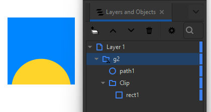
Clipping
One thing that I absolutely need to do a lot of times is to clip an image. This extremely basic task requires some sort of ritual to perform it correctly on Inkscape. First you need to have the shape you want to use as the clipping mask, e.g. a rectangle. This shape must be ABOVE the image you want to clip. If it's below, it won't work. Then you need to select both the image and the rectangle, right click on it, then clip on Set Clip.
✅ By contrast, on Affinity Designer, you literally just drag and drop the image into the rectangle in the layers panel and you are done. Every shape behaves as a "clip group" on Inkscape by default except without all the confusing object hierarchy. Drag and dropping a shape inside any other shape clips it.
This action doesn't hide the clipping shape, but you can hide it simply by setting its fill color to transparent.
Clipping with Stroke
On Inkscape, if you use Set Clip Group instead of Set Clip, you create a "clipping group" that is displayed, and anything you put inside this group gets clipped with the "group" being drawn behind the clipped objects. At first glance this sounds like Inherit Alpha on Krita, or clipping masks on CSP and similar software. There is only one problem: when you create a clipping group, the stroke disappears for some reason. That is, the clipping group essentially clips itself, and only clips itself using the "fills" of the vector shape. Since the stroke is outside the fills, the stroke gets clipped out!
This means you can't just make a simple rectangle with a contour and put something inside of it to clip it. But can you do this in Affinity Designer?
✅ Yes you can!

As anyone would expect, if you place a yellow circle inside a red blue with a black stroke, the yellow circle is clipped to the rectangle, and the stroke is drawn OVER the green circle and the rectangle.
Oh my God, I can not believe I have the functionality to do the most obvious thing possible with this software. Who would have expected that?
Text
As mentioned previously, all I use Inkscape for is for the very basic task of putting text on things. Inkscape is the best open source graphics editing software at handling text. That doesn't mean it's particularly good at it. It's just that its competition appears to be competing to decide who has the worst text-editing UI possible. And if you thought GIMP was bad, try Krita—it managed to be somehow worse.
If Affinity Designer can't handle text, I have no use for it.
✅ It does have text. Great. That's all I needed.
I notice that changing the font doesn't do anything. More specifically, changing the font size only changes the font size of the text you're about to type, it doesn't change the font size of the text you have already typed. This only happens if you have the text tool selected. If you select the "move tool," then the toolbar still displays the text properties, including the font size, and changing the font size changes the font size of the whole text.
✅ Copy-pasting text with different color and font size pastes the formatting as well, which is nice.
✅ I notice that copying a piece of text then using Ctrl+Shift+V pastes its formatting only, just like in Inkscape, which is nice.
✅ I notice there is a thing called STYLE that lets me use indirection with the text, WHICH IS REALLY, REALLY, REALLY NICE. I can simply set a text's style to "heading," and if I want to change all of my headings' font or size, I just change the style of one heading, then click the "Update Heading Style" button next to it, AND THEY ARE ALL UPDATED. As far as I know, the closest thing that Inkscape has to this is a weird button that lets you select all text in a document that has the same font family. Not even all text properties matching, just the font family. This is particularly weird when you realize that the SVG format supports classes, so if you wanted to do this with CSS on a webpage, you would be able to it easily, but there is no GUI on Inkscape to achieve this functionality.
✅ Pressing the up and down arrow keys while the font family combo box has keyboard focus lets me switch from one font family to the next, updating the font family of the text. While Inkscape supports similar functionality, Affinity's is better. Inkscape's combo box doesn't open by default, so it's hard to tell where you are on the list. When it does display, its width varies according to the width of the a rendered text using the font of each item, which means as items being displayed change, the width of the combo box changes, and that may occlude the text you're trying to preview. On Affinity, the width is fixed. I also notice there is a little heart icon which I imagine is for favoriting fonts. There may be a similar feature on Inkscape called "font collections," but I have never used it because I tend to jus use Noto these days, as it's installed everywhere, makes things simpler.
Note: on Inkscape 1.3 or 1.2, this functionality was actually broken because recently used fonts appeared first on the list on Inkscape, and pressing the arrow key tried to encounter the position of the current font by finding its index by name. Since used fonts appeared twice on the list, when you were about to select an already used font, e.g. Times New Roman on the "T" letter, it jumped all the way back to before Arial because Times New Roman was the first item in the list if it had been the only font used. Inkscape 1.4 fortunately fixed this issue.
✅ There are sensible controls for changing the line height on Affinity. On Inkscape, if you have a text with two different font sizes, that thing that reads "1.00 lines" on the toolbar simply doesn't work in any logical manner whatsoever. Changing the line height of one text affects the line height of the other line in unexpected ways, because I'd expect it to change only the current line's height. So what do you do? You select a piece of text and change its size? Then it becomes even more confusing because you can't tell which character you change the height of! It's as if this box is only there to confuse me.
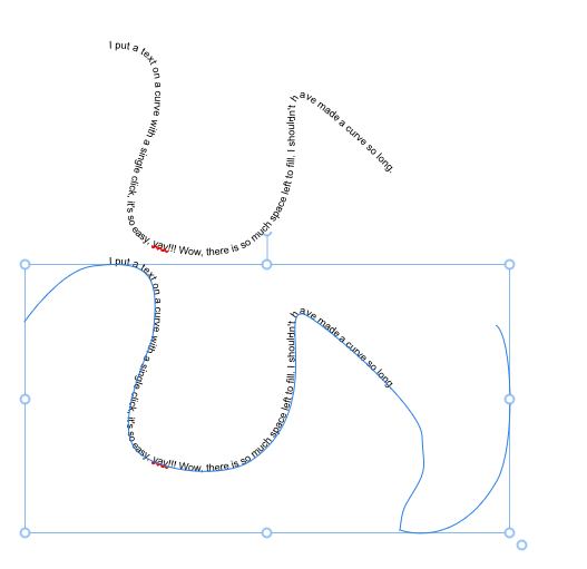
Text on Curves
To put text on a curve in Inkscape, first you create a curved line, then you add text, then you attach the text to the curved line with a menu option, then you hide the line because otherwise it will stay visible, then you un-hide it if you need to edit it because otherwise you won't be able to see it to edi ti.
✅ To put a text on a curve in Affinity Designer, first you draw a shape, then you click on it with text tool. Done. That's it. That's all you gotta do. The shape stops being a normal rendered shape and becomes a "ghost" shape you can control to change the path of the text.
Text Effects
So let's say you want to add a drop shadow to a text on Inkscape. You have to use filters. And, my God, who in the world thought this was a good idea.
I'm a programmer. I wrote a tutorial about how to create non-destructive chromatic aberration in Krita using only filter layers and clone layers. I do NOT want to touch Inkscape's filter editor dialog. Not in a million in years.
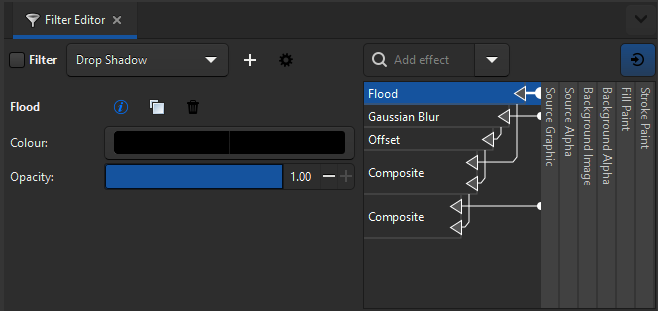
You see, the way some unparalleled genius of cleverness figured out to implement a drop shadow in a graphics editing program wasn't to just add a simple "drop shadow" property somewhere like anyone would expect. Instead, when you create a "filter" in Inkscape, you're actually creating a whole algorithm that is a filter, including steps like applying gaussian blur to the source shape, moving it to one side, etc. The plain obvious consequence of this is that YOU CAN'T EDIT THE FILTER AFTER YOU CREATE IT.
If you create a "drop shadow" in Inkscape, you don't get a "thing" called a drop shadow. You get 5 different things that when combined result in a drop shadow. Since you're technically allowed to modify those steps and even remove or replace them as you wish, it's not possible to reconstruct the "drop shadow" as a simple dialog window after it's been added to an object. You can't change the "blur of the drop shadow," you need to change the size of the gaussian blur that is a middle-step in the convoluted drop shadow processing pipeline. Of course, that's nonsense. There is a billion ways to solve this problem in a user-friendly way. It's merely that Inkscape doesn't solve it that way.
For example, if you know a drop shadow already creates a specific set 5 filters: a Flood, Gaussian Blur, Offset, and 2 Composite filters connected in a specific way, you should be able to load the settings of the drop shadow dialog based on the structure of what is currently found in the filter effects attached to an object. This would probably lead to more weird bugs in edge cases, but it's not impossible to do to fix the very basic case of editing a drop shadow.
An even more obvious consequence of this is that if you ever try to add TWO filters to a single object you end up with a mess TWICE AS BIG. I feel like Intel is going to want to add AI to Inkscape at some point to solve this filter issue instead of just making a better GUI.
Note: I just noticed that if you click the "Apply" button on the drop shadow filter in Inkscape, that doesn't even close the dialog, so you can accidentally applied the same filter twice thinking that if it were applied, the dialog would have closed, and if it hasn't closed, that would mean Inkscape lets you edit the effect that you already applied. The "Drop Shadow" that appears in the filter editor when you create a filter, by the way, is a preset like a gradient. It's just called that because the drop shadow dialog created it. You can modify it however you want and even rename it if you want. You can NOT add two separate presets to the same object. If you have a drop shadow preset, and an outline preset, you can't just combine both like you would expect to be able to. You have to create a third preset, called drop-shadow-and-outline in which you separately apply both the drop shadow AND the outline effect to create a mess of an arrow diagram in the filter editor that you won't ever want to touch that results in the effect you want. Probably you will want to just remove everything from the preset and re-add everything again every time you want to change anything, if you can remember the settings you used last time.
It's honestly difficult for me to believe that open source doesn't have the resources to have a good GUI when it evidently has the resources for overengineering things like this.
✅ By contrast, on Affinity Designer, it's a checkbox. Like you would expect. Just select the thing you want to put a drop shadow on, go to the Quick FX tab, check Outer Shadow, change radius, offset, angle, color, etc., and you're done. That's all it takes. Just as anyone with sanity would have expected of this the user story "the user wants to add a drop shadow to a text." I don't know how do you even get this wrong. At this point I really hope it's SVG that is holding Inkscape back, because some of these problems are just unexplainable.

I think it's also worth noting that even though Inkscape has a checkbox for "Live preview," for SOME REASON it's always unchecked by default. I wish I could understand who would open a dialog to create a drop shadow, or any effect, and not to want to see what the effect looks like before clicking a button that makes it impossible to edit the effect afterward. I'm really, really struggling to understand the use case here. Maybe the effect is too complex, it takes too long to process? But you can just render it asynchronously if that is the case.
Multiple Stroke
Inkscape doesn't support multiple strokes in any sensible way. The only way to get something close is via "Path -> Linked Offset" in the menubar. This creates a new object that is dynamically generated from an offset of a source object's silhouette. You can drag a control point to control the size of the offset. Effectively this would be size of your second stroke. The problem is that this is literally a separate object. If you move the source object, for example, the linked offset doesn't even move with it. Having to create a separate object in the node tree just to create a new second stroke also feels like a very hackish way to solve this problem. The only thing that linked offset solves is the fact that users were doing this MANUALLY because Inkscape didn't support multiple strokes. So we went from a manual hack, to an automated hack.
✅ By contrast, on Affinity Designer, you can add as many strokes as you want and reorder them in the "Appearance" panel. You can even add multiple fills. You can also add multiple outlines by using the Quick FX panel and clicking on the cog icon and then clicking on the plus (+) next to the Outline filter to add another one of it. For some reason it seems it's not possible to add multiple strokes to text, but it's possible to add multiple outlines. A user complain about it many years ago.
- https://forum.affinity.serif.com/index.php?/topic/105845-multiple-strokes-on-text-i-cant-apply-them/
Alignment
✅ I can align to the last selected in both Affinity and Inkscape, which is nice.
Lines and Arrows
One thing that I really need is the ability to create arrows, so I can point at things. I can do this in Inkscape, although I often run at problem styling the arrows, since those arrows are part of the "stroke," which causes all sorts of problems.
✅ On Affinity, I do have the ability to add arrows to the end of lines, which is nice. I have much better UI for selecting the size and shape of the arrow than I have in Inkscape.
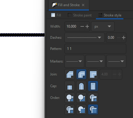
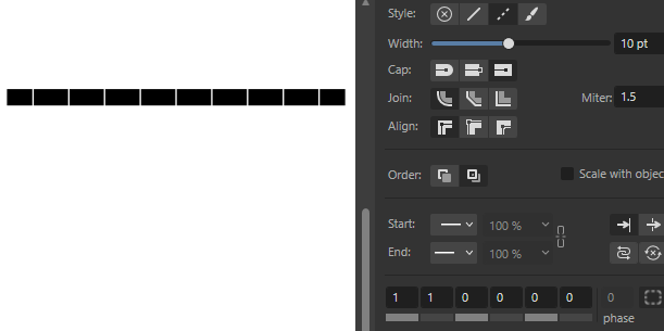
✅ I have a special UI for controlling how dashed or dotted lines should look like. On Inkscape, this is just a huge dropdown! I never have any idea of what my line is going to look like until I select one option.
Revised (2024-12-11): it seems the reason why Inkscape's dashed lines feel so unreliable is because I had "square caps" set (I think this is the default) so dashed lines had longer dashes than they should be. Despite both Inkscape and Affinity Designer looking "wrong" when you set a dashed line with square caps, on Inkscape I just assumed Inkscape had a bug, while on Affinity Designer, I assume there was something else interfering with the line's appearance. That's because on Inkscape, a 1:1 line with square caps looks like a normal line. On Affinity, there is still a gap, so at least you can tell dashes are working, just not the way you would have expected, indicating that there is some setting somewhere that may be interfering with it, in this case, the square caps.
✅ Affinity also provides tools like the "corner tool" and "stroke width" tool that in Inkscape would only be available as Live Path Effects.
Clones & Symbols
✅ Affinity supports symbols, just like Inkscape, which is nice.
It doesn't seem to support clones, though, just symbols, although the symbol seem to be editable, so it should be practically the same thing.
Exporting
✅ Affinity Designer has an export dialog. Something I wish Inkscape had. Inkscape has an export dockable panel instead, which means, for example, that it's designed to fit in the side pane's minimum width, so it's too tall, and if your screen isn't tall enough, you have scroll bars, and clicking the export button doesn't close the panel, so every time you export something, you're stuck looking at this export panel you no longer have any business with, until you click on something.
Affinity's can export the whole document, selection area, or selection only (with transparent background). There have been times I needed each one of these export options, all of which are available on Inkscape, so I'm glad that Affinity also provides all of them.
Canvas Clipping
After writing this review, I tried to redo a thumbnail I made in Affinity Designer using Inkscape, and I noticed a couple of other things. For example, Affinity Designer clips the contents of the document to the canvas (more specifically, to the artboard) by default.
This may not sound like it's not important, but it makes a world of difference when you're trying to position elements on the canvas, since you can't actually tell where the canvas edges are if it isn't clipped. A border is shown, but if you have an image larger than the canvas, for example, it just extends beyond the border, so you don't have a real sense of visual balance.
I could create a clip for this in Inkscape, but then everything you do need to happen inside the clip, which means every time you want to move the image, you are going to need to enter the clip to move it. I could put everything INSIDE the clip, but often that only makes things even more complicated.
On Inkscape, if an object is clipped out, you can't select it by clicking where it would be if it isn't rendered. This means you can't click on it to drag and move it INTO the visible area. On Affinity Designer, you can click on an object even if it's invisible because it's located outside the canvas' frame.
Revised (2024-12-11): it seems Inkscape does have this feature! On Document properties, check "Clip to page" under "Render."
Things Affinity Doesn't Have, But Inkscape Does
Affinity doesn't have repeating gradients.
I was told Affinity can't vectorize images, and it's possible it lacks some of the "advanced" features Inkscape has. For example, even from this article it's clear that Inkscape's filter system is far more powerful than Affinity's (and other software's) simple "layer styles." I'm sure there are all sorts of effects you can do with Inkscape that would be impossible to achieve elsewhere.
Designer doesn't currently have a auto vector trace tool
https://forum.affinity.serif.com/index.php?/topic/187386-affinity-designer-how-can-i-convert-selected-image-to-vector/&do=findComment&comment=1093153, "Posted June 8, 2023" (accessed 2024-12-11)
It's also possible that Affinity doesn't have great support for exporting as SVG, if it can export as SVG at all, because I haven't tested that. Inkscape is essentially an SVG editor, and I think that's its biggest issue. I don't want a SVG editor, I want an application to create graphics. Even if I wanted to create an SVG, depending on Affinity's usability, I feel it could be easier to create the graphic in Affinity, e.g. an icon, export a PNG, then import that PNG into Inkscape and trace over it so I can export it as a SVG.
Conclusions
Affinity Designer solves a LOT of the problems I had with Inkscape. They weren't big problems, and there were always workarounds, but they were certainly annoyances that frustrated me to no end. It's clear that Affinity Designer is at least more polished toward my needs than Inkscape currently is. The only question left is whether it's worth buying it just not to deal with Inkscape's issues, when I could just use Inkscape for free forever.