I love being wrong, which is great because I'm wrong far more often than I wish I were. Being wrong and realizing it means you have the opportunity to learn. The opposite would be insisting you're right despite evidence of the contrary. Recently, this has happened to me in a rather unexpected way: while reviewing an RSS client, I had the truth rubbed against my face: web design can't work the way I wish it worked, and, in particular, the way I designed article feeds is just bad.
I generally don't like the way modern websites look, too much white space, padding, margins. Articles are adorned with images that are completely irrelevant to the article, and these appear above the fold. Much of this feels like madness to me. Since I have a website now, I figured I could just do exactly the opposite of what I thought was bad, and surely the result would be good. Unfortunately for me, I'm not very good at designing webpages.
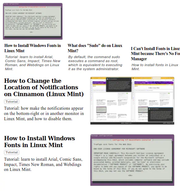
Mistake 1: No Images
I thought: well, I don't like useless images, so, naturally, most articles won't have images if I can't find an image that can represent the article.
Surely you can agree with me that this is a very sensible statement?
However, when designing a feed, this variability of images increases complexity. Some articles have images, others don't. For articles that do have images, I have to display them somewhere in the feed, which means articles with images will look different from articles without.
I can think of 3 solutions for this problem.
Solution 1: Nobody Gets Images
The first solution one can think of is: if images are optional, but titles are required, just show only the titles, and then you have a consistent look.
I didn't even try this because I do have some categories that benefit from images, e.g. categories that list applications, where the image of an article is the screenshot of the application. I didn't want to sacrifice those images, so I had to place them on the page somehow.
Solution 2: Placeholders
A second solution would be to use some generic placeholder image to occupy the space of a thumbnail in articles that don't have images. While this would save the space issue, this didn't feel like a good idea. The irrelevant image for the article can at least be hand-selected per article. This placeholder would be the same for every article. It's even more useless.
Solution 3: Reorder Articles
A third solution is to display all articles that feature images prominently at the start of the feed, and all articles that don't at the end of the feed. While this isn't perfect, it can be done entirely with CSS, and will make the feed more consistent.
.article:has(.image) {
    order: -1;
}
The code above would move all articles with images to the top of the feed, if the feed is display: flex;.
I actually implement this later, although originally I hadn't.
What I Actually Did: Nothing
After spending some time tweaking the CSS, I essentially gave up. I thought: "it can't get better than this. This is an unsolvable problem. This is good enough." Of course, it was none of these things.
The problems of the design were soon discovered.
I thought placing the image on top would look good because it just felt right for the image to be on top. I deliberately aligned the text of image-less articles to be at the bottom so the titles looked more or less aligned. This was a mistake because in a row where one article has a tall image and the rest of the articles don't have images, it looks like there is only one article if the bottom of the row isn't visible on the screen. If they were aligned at the top, this wouldn't have happened.
Mistake 2: Text You Don't Read
The second mistake I made was thinking people read text.
I thought: well, most websites just use an image and title on their feeds, which naturally means that my website, by being the obstinate contrarian it is, needs to have more text. More text is good.
So I put excerpts under the title.
This really didn't work, for multiple reasons.
Problem 1: What to Write
The first problem is what would you even write as a description of the article that isn't already written in the title.
In many cases, I found myself writing things like this:
Title: "How to Do X."
Description: "Tutorial: Learn How to Do X."
After all that talk about avoiding irrelevant images because they were useless, it's really ironic that I ended up writing redundant descriptions!
In other cases, the description literally contains all the steps of the tutorial, because most tasks can be explained in a few words.
Problem 2: Text Blindness
Whether the text is useful or redundant is actually irrelevant, because you don't read the text in any case. If you don't ever read it, you won't ever notice if it's redundant or not, nor would you ever gain any utility from it.
The reason for this is that the title exists. The image exists (probably).
When a reader looks at the feed, they can decide whether or not the article interests them based on title and image alone. They will decide instantly. If they decide it's interesting, they will click on it to start reading right away. If they decide it's not interesting, they won't even read the whole title, much less the description of the article!
Readers don't read feeds or articles on the web, they scan.
This means that the proper way of conveying information through this medium is to craft visual content that can make their eyes stop for a moment to actually read.
Some of the things I knew, or assumed I already knew, fortunately remain valid: humans are natural creatures, born to view the full spectrum of colors from above infrared to below ultraviolet. The easiest way to design something that is eye-catching is to add variance. Bold text is a perfect example of this. Simply because some text is slightly blacker than other text, humans will stop skimming to glance at it. It's eye-catching.
The description is just plain text. The title must be bigger and bolder to establish a visual hierarchy between the inferior description of the article and the superior title above it. With this in consideration, this truly feels like an unsolvable problem. There is no way to design a description that is readable, because in order to be readable, it must be eye-catching, and for that purpose it would need to use design devices that would normally place it on a higher level in the visual hierarchy than the title.
The description is just not readable, by design. There is no way to make it readable. It's shadowed by the title, image, and any other elements that can vary in color.
This doesn't mean the description is useless. If we know what it can't be used for, that means we can focus on writing descriptions more appropriate for the functions it can actually perform. Perhaps someone out there who actually reads text would even benefit from them!
Badges as a Solution
While trying to improve the feeds situation, I decided to add something I called "badges" to the articles, for the lack of a better term. A badge is a keyword that is (currently) displayed under the title with a border. These are practically tags.
For example, some applications are available only for Windows, some only for Linux. At first, I thought I'd write this information in the description of the article, but this description is unreadable. It doesn't matter if I write "X is an app for Windows/Linux" or "[Windows/Linux] X is an app." The description is so unreadable that I might as well not have written it.
With "badges," I can make relevant keywords appear under the title and above the description. Although it's not implemented currently, I plan to add icons and colors to the badges, so you can instantly understand the difference between articles in a feed.
Currently they look like (Windows) (Linux) (Free) (Open Source), etc., written between the title and description. Although there are hundreds of articles without badges, the idea is that every article must have at least one badge to indicate what sort of article it's supposed to be.
Mistake 3: Misunderstanding Feeds
What made me take a better look at my own feeds was trying to use RSS.
RSS sounded like a very cool technology, so I really wanted to try using it. For that purpose, I took at look at which RSS clients were available, and I reviewed them. See [Comparison of RSS Readers] for details.
I wanted to find the best RSS client before I even started using RSS. After reviewing a few of them, and then FINALLY trying to actually use the thing, I realized a lot of what I thought I knew about article feeds was wrong.
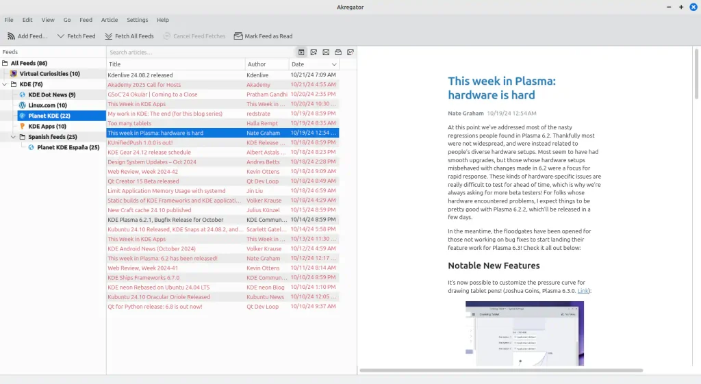
The average desktop RSS reader doesn't have have a typical "feed" of articles in the web sense despite its job being literally to display RSS feeds. Instead, you'll see that they generally display the fetched articles as a tabular list. You can only read the title of the article, and if you click on it, it shows the contents of the article in a different pane.
![A window titled [200] RSS Guard 4.7.4. In it, a left pane with a list of feeds in nested folders. A folder called "Labels" with an item "Interesting Articles" inside. A group called "Regex queries" with "(good|great) news" inside. An item for important articles, unread articles, and a recycle bin. On the right, two horizontal panes, one on top of the other: a tabular list of articles on the top, and the contents of the selected article at the bottom.](https://www.virtualcuriosities.com/wp-content/uploads/2024/10/rss-guard-view-article-20241025-1024x545.webp)
One thing that I immediately noticed is that most of them are incapable of displaying thumbnails. The reason for this is actually pretty simple. The RSS feed that client downloads is just XML code that may contain HTML code that may contain URLs of images. In order to show thumbnails for every single article, the RSS reader would have to automatically start downloading the first image it finds on every single article and store it somewhere, which is more complicated than just downloading the XML code and showing it as a list.
But that's great, isn't it? Most images on articles are useless anyway!
Turns out I was wrong.
After trying to use an RSS client for a while, I hate to admit it, but I have to admit that I was bored out of my mind and completely overwhelmed by the sheer amount of articles that kept coming.
If you subscribe even to a few RSS feeds, you'll quickly have hundreds of articles to read, most of which won't interest you. And there is something just "stuffy" about browsing these articles as a tabular list.
It's so stuffy that I actually figure out a trick to not have to look at the list. Instead of looking at the list, look at the title in the main pane, then press up and down to change the article, that way you can read the big title on the main pane instead of reading the titles in the list.
It became clear to me that I didn't enjoy reading. At least not reading headlines listed like this. That's so strange to me because I do use a few link aggregator websites like (Old) Reddit an Hacker News and I never had trouble with their design. Perhaps it was because the font was bigger, and there were other elements like links to comments and date that were displayed in lighter font?
Text is uncomfortable. Too much text displayed too densely is uncomfortable.
I thought I'd be able to use RSS to just casually browse some news. I don't find myself able to do it. At least not like this.
Then I discovered Fluent Reader.

Browsing articles on this RSS client felt pleasant. Comfortable. An enjoyable experience.
It was so enjoyable I was forced to reconsider my terrible web design choices.
It became extremely clear to me that there WAS a way to design a feed that felt comfortable to browse, and there was ALSO a way to design a feed that felt UNCOMFORTABLE to browse, and I was doing the latter.
And this wasn't just about images. I couldn't even make that excuse. Even articles without images feel comfortable to look at in Fluent Reader's feed. The title stands out. It's readable. The articles are clearly separated with rectangles which helps you focus. It doesn't feel "stuffy." It feels a relaxing experience.
But still, there is so much white space. So much margin.
As the contrarian I am, I tried to improve my design as I could while avoiding margins. I thought if I used lines I wouldn't need margins as separators. This didn't work. Perhaps my design skills aren't good enough, perhaps it would have worked is the whole page didn't have a white background, perhaps it's impossible. In any case, I decided to just copy what I liked.
Larger, more eye-catching titles. More space for each article. I want to use serifed text no matter what. That, too, backfired. It needs to be bigger to be as legible and eye-catching as sans-serif, I feel.
I ended up, ironically, with something that consumes more space per article than Fluent Reader does. I'm not happy with it, but it's an improvement over what I previously had.
Future Work
In the future, I might want to try to come up with a better feed building upon what I learned so far, perhaps trying to make it smaller and closer than what I thought would be ideal. For now I'm collecting feeds with designs that please me. Maybe by having them as a reference, I can come up with an idea for how mine should ideally look.
For instance, New Element's is really nice, but it's image-centric.
Another interesting example I found was Dexigner [dexigner.com]. Their feed has title and description.
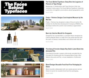
Dexigner solves the layout problem of images by enforcing a rule that all images must be displayed at the exact same size. Personally, I don't really like this solution because it would require me to have images for all articles, and if an article has an image, it would be clipped if I enforced it to be displayed at specific dimensions. however, it's still a very interesting solution worth considering.
By default, WordPress generates medium-size images that are 300px wide. I ideally I would use all of these 300px. This means if I place images side by side, on a 1600px wide screen, I can only display a maximum of 5 columns. If text is at the side like in Dexigner, the number of articles per row will become fewer.
It's possible that the reason why Dexigner looks so good to me is that the it's a single column layout such that the titles and descriptions are aligned. This would mean that using a grid layout or a flex layout is actually detrimental.
It's possible that, because there is no clear genre or format for mots of my articles, it's just not possible to create an universally good design for the feeds because what is most important varies from article to article. Perhaps the best solution would be to add some Javascript to the page to let the user change the layout of the feed.