To create the duotone effect in Krita, follow the following steps:
1: open the photo or image you want to edit in Krita.
2: add a Adjust -> Desaturate filter layer to the image to make it grayscale. Choose the BT.709 method. Although this method makes most sense in general, because this is just one step of the visual effect, in some cases you might want to use a different and perhaps unusual method such as Max or Min to change how the different color channels contribute to lightness in the desaturation process.


3: add an Adjust -> Levels filter layer. You don't need to adjust its settings for now, simply add it.

4: add an Map -> Gradient Map filter layer.
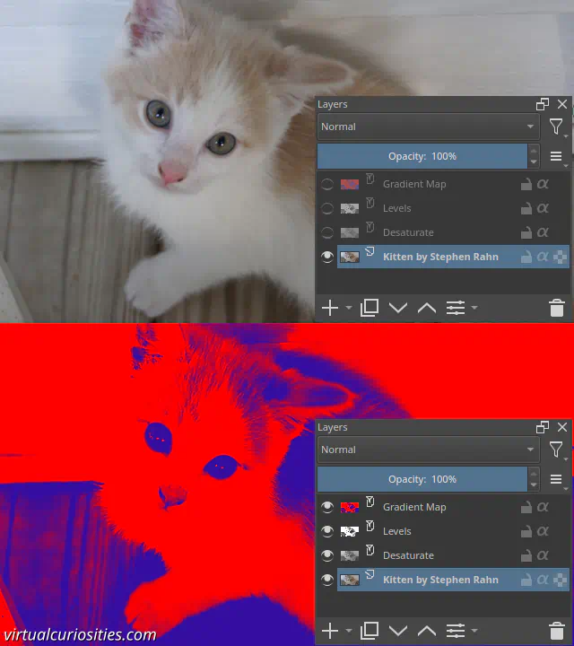
Note: your layer stack should be in this order:
- Gradient Map Filter
- Levels Filter
- Desaturate Filter
- Your image
You can now use the Gradient Map to pick the two colors of your duotone.
5: double click on a control point to change its color. Do this for the control points on both sides. Don't worry about colors looking too saturated. Simply pick the colors you want.

Tip: Krita supports both "stop" gradients and "segment" gradients. Personally, I think it's easier to work with stop gradients. Click on the Convert to Stop Gradient button to convert to this type.
6: click OK to apply your changes.
7: open the properties of the Levels filter we added previous by right clicking on it to open its context menu and clicking on Properties....
8: move the control points of the Input Levels toward the center to increase the contrast of the duotone effect.
Tip: although the duotone effect looks really cool, it works better if you have an appropriate photo. An appropriate photo for a duotone effect would be one that has the subject (the person, the model) in front of a dark background or in front of a light background. If possible a flat background rather than a photo taken in front of curtains or outside. he appropriate lightness of the background depends on their skin tone and what type of effect you want to accomplish. For example, if the subject is light-skinned and you want the background to "merge" with their face, the background needs to be light, if you want contrast, it needs to be darker, but if you want an outline around the face separating it from the background, then the background needs to be lighter than their skin tone.
Tip: if the effect looks too saturated, one trick that you can use is move the Output Levels toward the center. This can quickly make the duotone effect feel more like a "real" material.