Today Youtube updated the new Youtube Studio's "Content" section dashboard to me. As it often happens with "updates," the new version of the dashboard is worse than the previous one.
New "Overview" Content Page
The first and clearly stupidest change was to add an "overview" page before the tabular view of data.
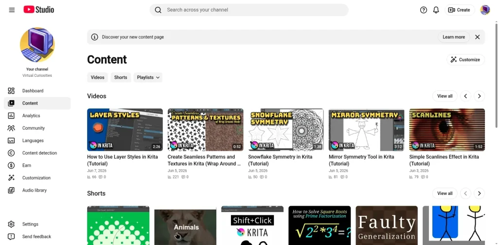
Now, clicking on the "Content" section shows you a page with your first five or so videos, shorts, and playlists as large thumbnails. You need to click on "View all" to view the page with the tabular format from before.
Before, when you clicked on the "Content" section, you'd view data about your videos (long form content) with links to switch to "Shorts" and "Playlists" at the top of the table.
New "Tabular" Content Page
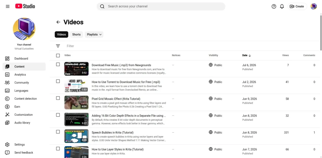
The new tabular "Content" section has fewer columns. It no longer has the "like" count. I don't remember whether it had the "dislike" count before, or if it had been removed already, but the "like" count is now missing.
The Problems with this Update
The key problem with this update is that the overview page doesn't actually give the user (in this case, me) ANY FUNCTIONALITY that wasn't already available in the tabular page.
The new overview page isn't only less functional, providing less information in a less compact way, and having fewer actions in a less desirable order, it also degrades the experience because now in order to get to the tabular page that is actually useful I have to go through this useless thing every single time. It just increased the number of clicks you need to get stuff done.
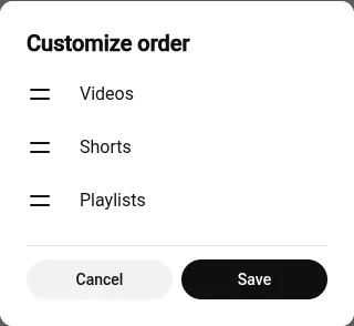
But the most disrespectful thing, in my opinion, is the button to "customize" the overview page in the corner that doesn't let you just say "I don't want this, just show me the old one." Instead the only thing you can customize is the order of the "videos, shorts, playlists" sections that are displayed in the overview.
Information Comparison
Currently, the only information the tabular count reveals now is:
- The thumbnail, title, and description of the video to identify it. Hovering over this gives you a few actions.
- Notices, which I assume are copyright strikes, but I never got any so I'm not sure.
- Whether the video is public, unlisted or private.
- The date of publication, which Youtube uses as default sorting order.
- Number of views.
- Number of comments.
The seventh item used to be the number of likes. That is gone with this update.
According to Youtube, there should also be a new "estimated revenue" for monetized channels. I'm not sure if this needed the space taken by the likes column, but I assume you wouldn't need to remove a column just to add a new column.
Estimated Revenue
https://support.google.com/youtube/thread/444479993/new-ways-to-get-quick-insights-into-your-channel-with-a-redesigned-content-tab?hl=en (accessed 22026-07-06)
We are also adding a new dedicated "Estimated revenue" column. This provides a comprehensive view of your video's estimated earnings across all streams, including ads earnings, YouTube Premium revenue, YouTube Shopping revenue, and other fan funding revenue. Please keep in mind that estimated revenue data typically takes about two days to process. This means that the revenue estimate you see will have a two-day lag. In addition, when you first publish a video you may see a clock icon for a couple of days while your earnings estimate is being finalized.
By contrast, the overview dashboard only shows:
- Large thumbnail wasting space.
- Title. No description.
- Date.
- Number of views.
- Number of comments.
But it gets worse.
Action Comparison
If you hover over a thumbnail in the tabular view, you have access to the following actions:
- Details: goes to the video's edit page.
- Analytics: goes to the video's analytics page.
- Comments: view the video's comments.
- View on Youtube.
- More options: edit title and description, get shareable link, promote, download, delete forever.
By contrast, covering over a thumbnail in the overview view gives you the following actions:
- Edit video: goes to the video's edit page.
- Analytics: goes to the video's analytics page.
- Promote: let's you pay Youtube money to promote the video.
- More options: share, comments, download, delete forever, view on youtube.
There are two things we can observe.
The first one is that, one of the most useful features of the tabular view, "edit title and description," which lets you change the title and description of a video without having to go to another page, is not available in the overview page. This isn't a space issue, since the command to perform this action was hidden inside the "more options" menu. Youtube just didn't feel like adding it to the overview page.
The second one is that the priority of some actions switched places.
In the tabular content page, the links to view "Comments" on a video and to "View on Youtube" appeared as you hovered it, while the link to "Promote" the video on Youtube was hidden in more options.
Now, the button to "Promote" it takes priority, while the ones to view "Comments" and "View on Youtube" are hidden in more options.
Conclusion
As a pessimist person, this makes me feel like the whole point of this update was a subtle ad for the "Promote" function: that Youtube decided to worsen the user experience of millions of users just to make the ability to pay Youtube to promote your videos slightly more prominent.
I admit that this sounds pretty absurd, but it's the only conclusion you can have based on the following facts:
- The overview page provides negative value to the user and has no reason to exist.
- The order of the actions in the overview page differs from the order of the actions in the tabular page.
Keep in mind that both pages have a "More Options" menu and work very similarly. If you were just copying the "display actions when you hover" functionality of the other page, you would just copy the actions in the exact same order they existed in the other page. If you change the other, that needs to be deliberate. Someone must have decided, for some reason, that "Promote" should leave "More Options" and go to the front, while "Comments" and "View on Youtube" should get hidden.
As Google is a big data company I'm sure that it has a lot of data about the behavior of its users so it can tell which buttons are clicked most often. Yet, if it just wanted to switch the order of the buttons, it could just have done so in the original tabular page.
In fact, there are multiple other ways to solve this problem.
You could just show the buttons by most recently used.
You could, *gasp*, let the user customize the order of the buttons! Now that's a novel idea.
You could do it like Google web search and just display the buttons in completely random order. Seriously, what is up with that?
As I write this I realize that there is a second, even more stupid possibility: Youtube wanted to help Shorts creators by placing Shorts videos first, but it couldn't do so without alienating long-form creators, so it created a page that lets you customize the order of which videos appear: Videos, Shorts, or Playlists. This is even more far-fetched since if you wanted to prioritize Shorts, you could just have added the "customize" ability to the tabular page and let the user choose to default to Shorts instead of long-form Videos. The only possibility one could imagine is that, for some reason, this needed to be done because for users that only upload Shorts the tabular page always defaults to filtering by Videos so it always shows nothing, and yet developers weren't allowed to modify the existing tabular page, so it had to be done by creating a separate page that allows customization. Does this sound plausible? Maybe, but it sounds like a mess.
Perhaps all these theories are wrong, and the correct answer is much more simple: someone thought this was a good idea?